The use of color is one of the most important aspects of any interior or exterior design. We may all be familiar with the basic distinction between warm and cool colors, but this concept becomes very important when designing an outdoor room with a certain desired atmosphere or aesthetic. Here is a simple guide to using cool and warm colors within your hardscape, alongside examples of homeowners who have achieved gorgeous color combinations.

Where to use warm colors
Warm color schemes consist of variations and combinations of orange, red and yellow. When we see warm colors, we mentally couple them with the concept of physical warmth and can therefore experience the feelings we associate with sunlight or summertime, for example. Just like dark colors, warm colors make rooms appear smaller and cozier because they almost seem to ‘come closer’ to you. These colors are also vibrant and energizing, so use them in spaces where you’d rather feel invigorated than meditative.

Where to use cool colors
Cool colors are built upon hues of blue, green and purple, and often have a soothing effect. The mental connections that can be made when looking at cool colors include the sky, water, ice or snow. Unlike warm colors, cool colors appear to be more distant and can effectively make an outdoor room feel larger. Cool colors should be considered for your personal backyard get-away spots, or any other room you use to feel relaxed and refreshed.
Related Read: Patio Pavers for Modern Landscape Designs

A balanced use of color
When dealing with warm and cool colors, it is important to remember that your outdoor room should contain both. If you are opting for an intimate, cozy atmosphere, then warm colors should dominate the color palette. However, cool colors should also be incorporated in order to create contrasts and find a visual balance.
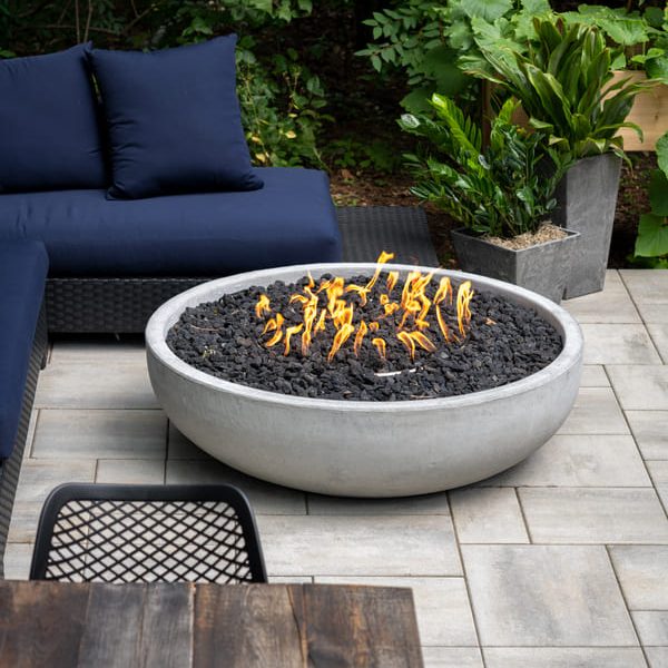
This homeowner has merged a selection of warm and cool colors and still achieved an airy, spacious landscape design. The Summer Wheat Umbriano pavers underfoot are quite subdued, but still bear warm, sandy undertones. The wooden furniture, materials within the fire pit, and the odd orange accent pillow all contribute further warmth to the design. However, the patio is surrounded in a wonderfully cool and soothing lawn which, alongside the blue accent pillows, creates a visual balance. The relaxed atmosphere that cool colors create has still been achieved, but the patio design is more visually intriguing than if only cool colors were to be used.
Related Read: 8 Ways to Add Color to your Outdoor Living Spaces

Achieving a cozy fireside patio
Warm and cool colors can effectively make you feel warmer or colder through the effect they have on light. Consider how this warm patio floor reflects the soft light from the outdoor fireplace and surrounding lanterns, enhancing the cozy atmosphere of the room. These Copthorne pavers have been selected in a rich blend of Burgundy Red, Burnt Clay, and Old Oak. The slight difference in color between one paver and another serves to add interest to the patio floor and make it more unique. Notice how the warm colors in this patio make it feel smaller and more intimate. The rich reds present effectively add a rustic touch to the patio design as well.
Related Read: How To Make Your Outdoor Fireplace the Center of Attention

Working with green, spacious landscapes
If you have a large landscape full of plants and trees, your starting color palette is wonderfully cool. Consider working to complement the existing color palette rather than tearing it down. For example, swimming pools generally look stunning near greenery, as the cool green and blue hues complement one another and create a relaxing, resort-like atmosphere. In order to create a balance of colors, this homeowner has incorporated reds and yellows into the patio furniture. The Beacon Hill Flagstone underfoot also bears very subtle warm undertones. Although many pavers may appear to be perfectly neutral, they bear the very faint undertones of a more distinct color. Their underlying warmth or coolness may only become noticeable when they are combined to pave a large area.
Related Read: Create Outstanding Pool Decks with these Concrete Pavers and Coping Units
An earthy Copthorne border surrounds the pool and contributes further warmth to the color palette, while creating an interesting contrast against the clear blue water nearby. The cool tones within your natural softscape can often be more powerful than the colors you incorporate into your patio design, especially if there are large, looming trees nearby. You may therefore consider incorporating plenty of warm tones into your hardscape in order to create a pleasant balance and prevent the cool greens of nature from overwhelming your landscape design.
